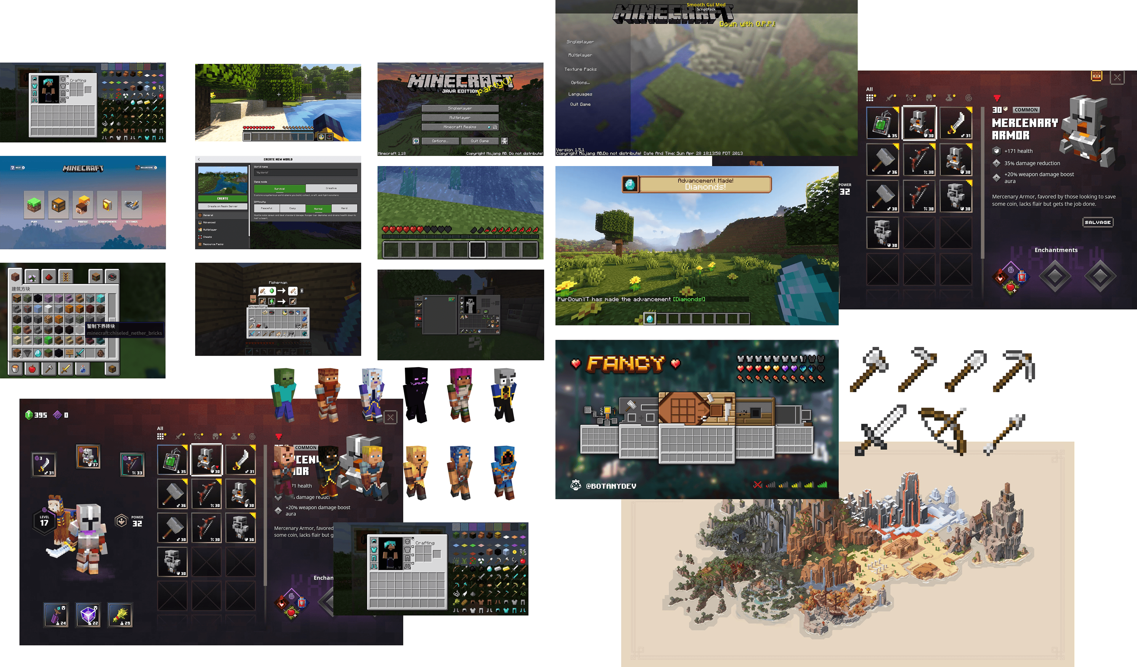
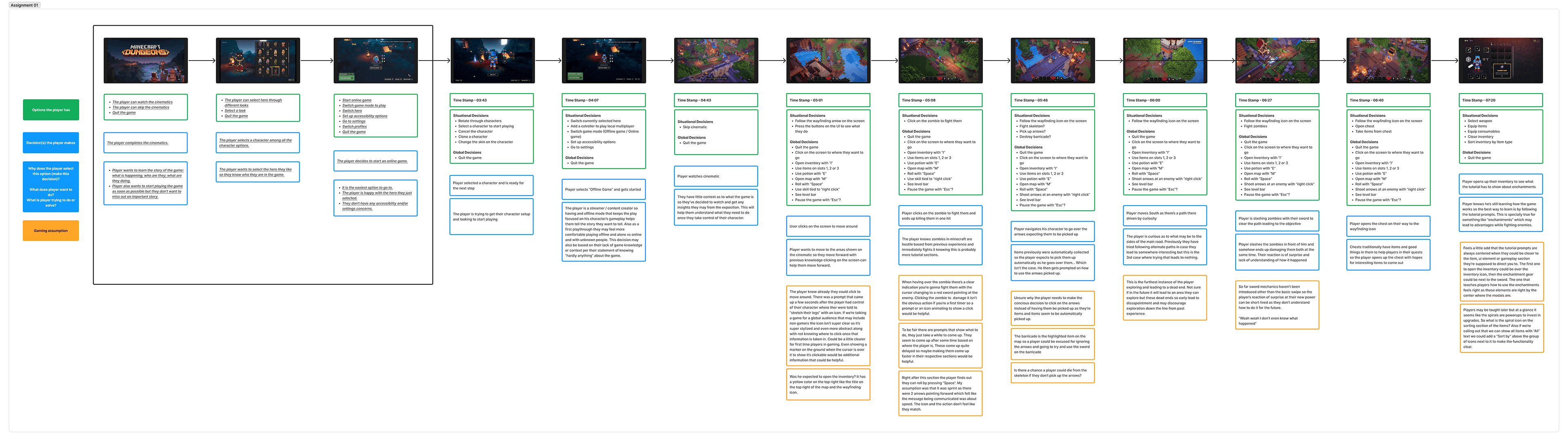
Minecraft Dungeons presents a roleplaying experience that vastly expands on the original game showcasing a surprisingly complex set of systems for new players
Tools
Figma, Photoshop, Illustrator, After Effects, Lottie
Skills
User Research, Content Strategy, Sitemapping, Wireframing, Prototyping, User Testing, UI Design, Interaction Design
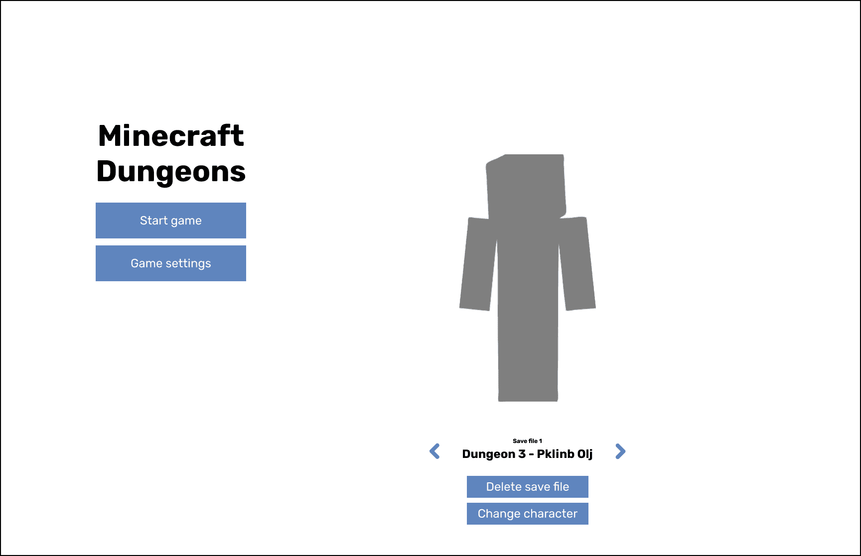
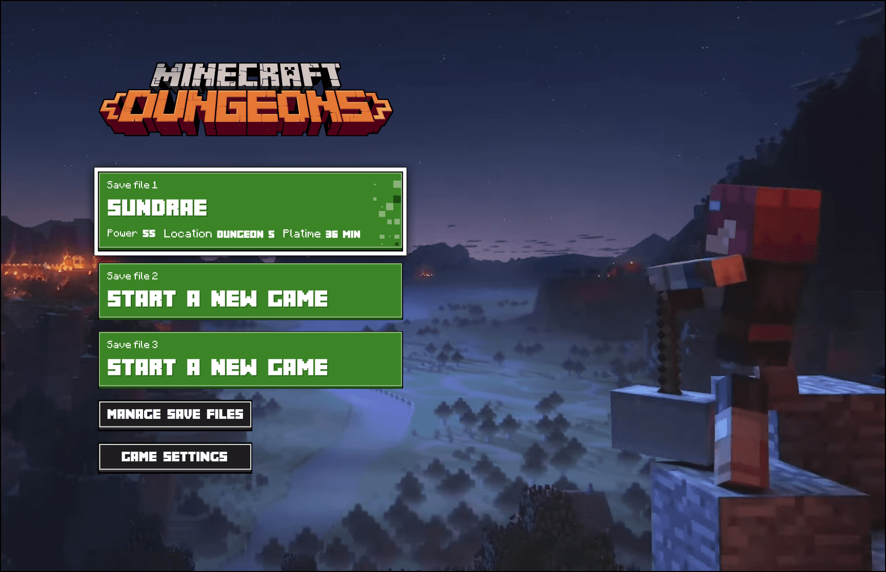
Main Menu
I tried combining save files and the selection on the right side to keep the left side focused on the "Start game".
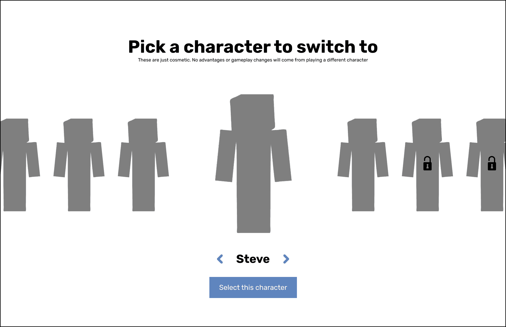
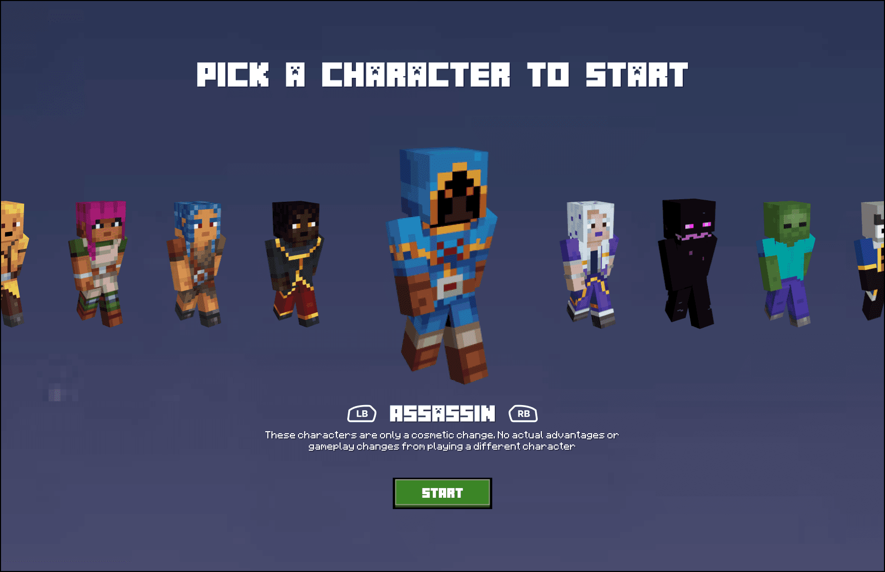
Character Selection
A simple carousel where you select the character you want by moving from side to side.
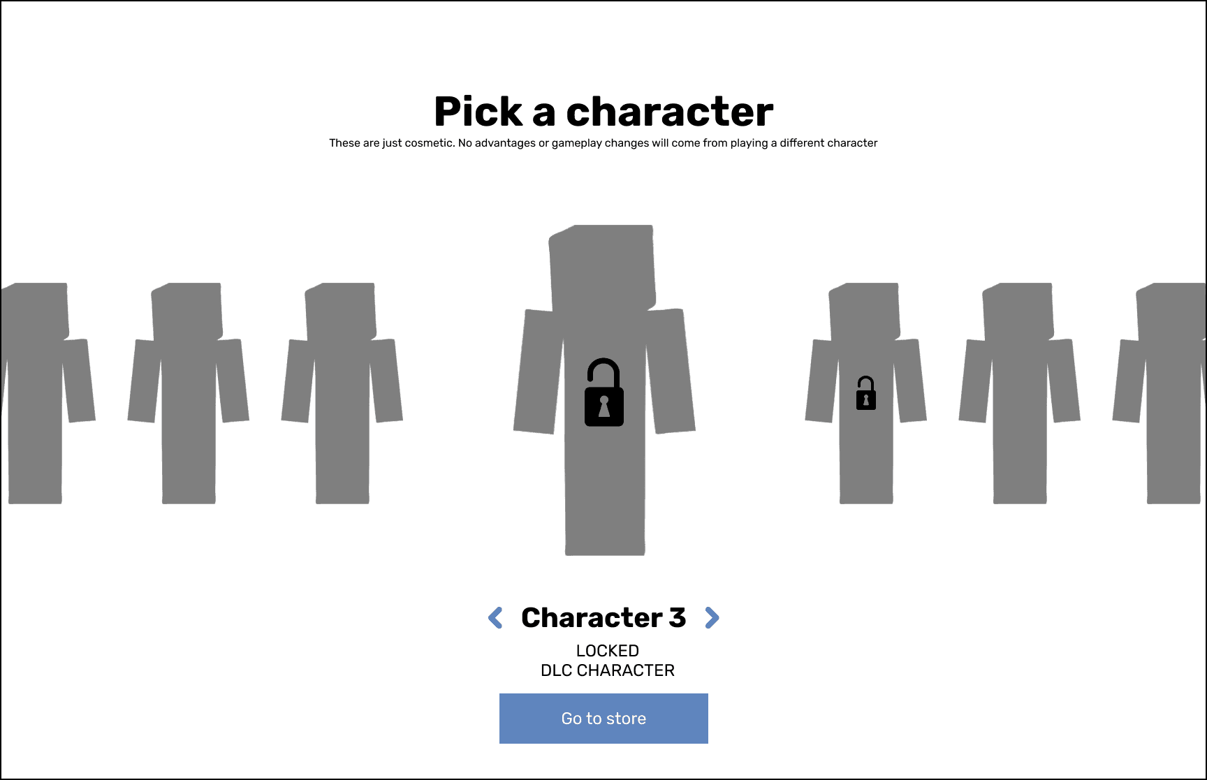
Character Selection (Locked)
Additional view to show locked characters.
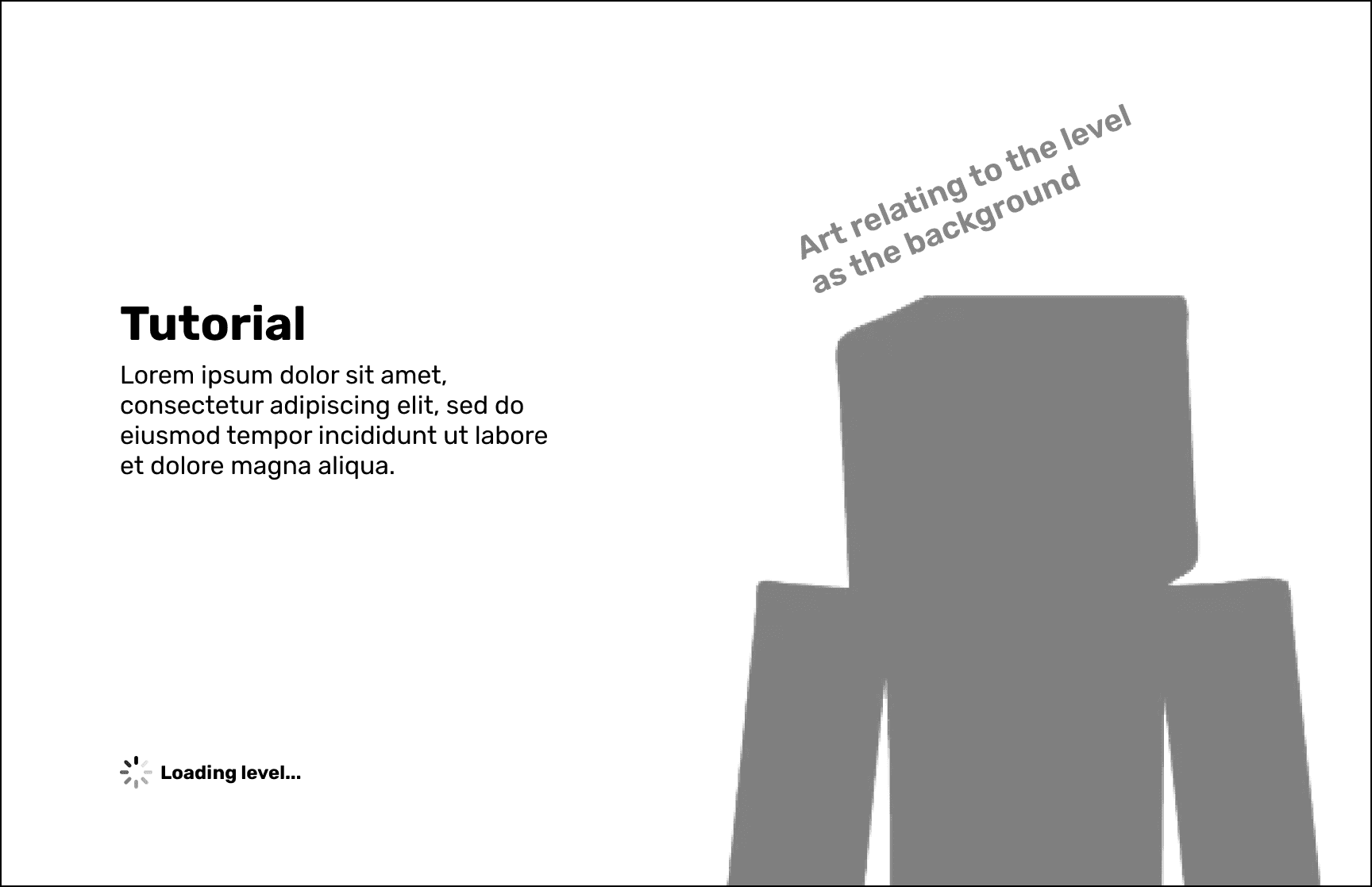
Loading Screen
While players wait for the level to load they get some lore or art in the background.
Inventory Management
Inventory (Main)
Equipped items appeared left, full inventory right. Item selection revealed equip/drop controls for multiplayer item sharing.
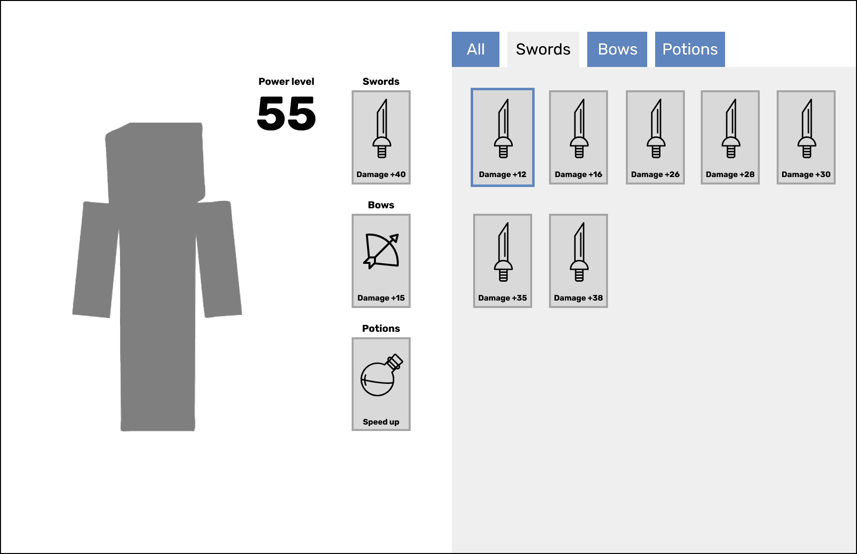
Inventory (Swords)
Tabs at the top would allow for users to sort through item types for a more focused view.
Level Selection & Party Creation
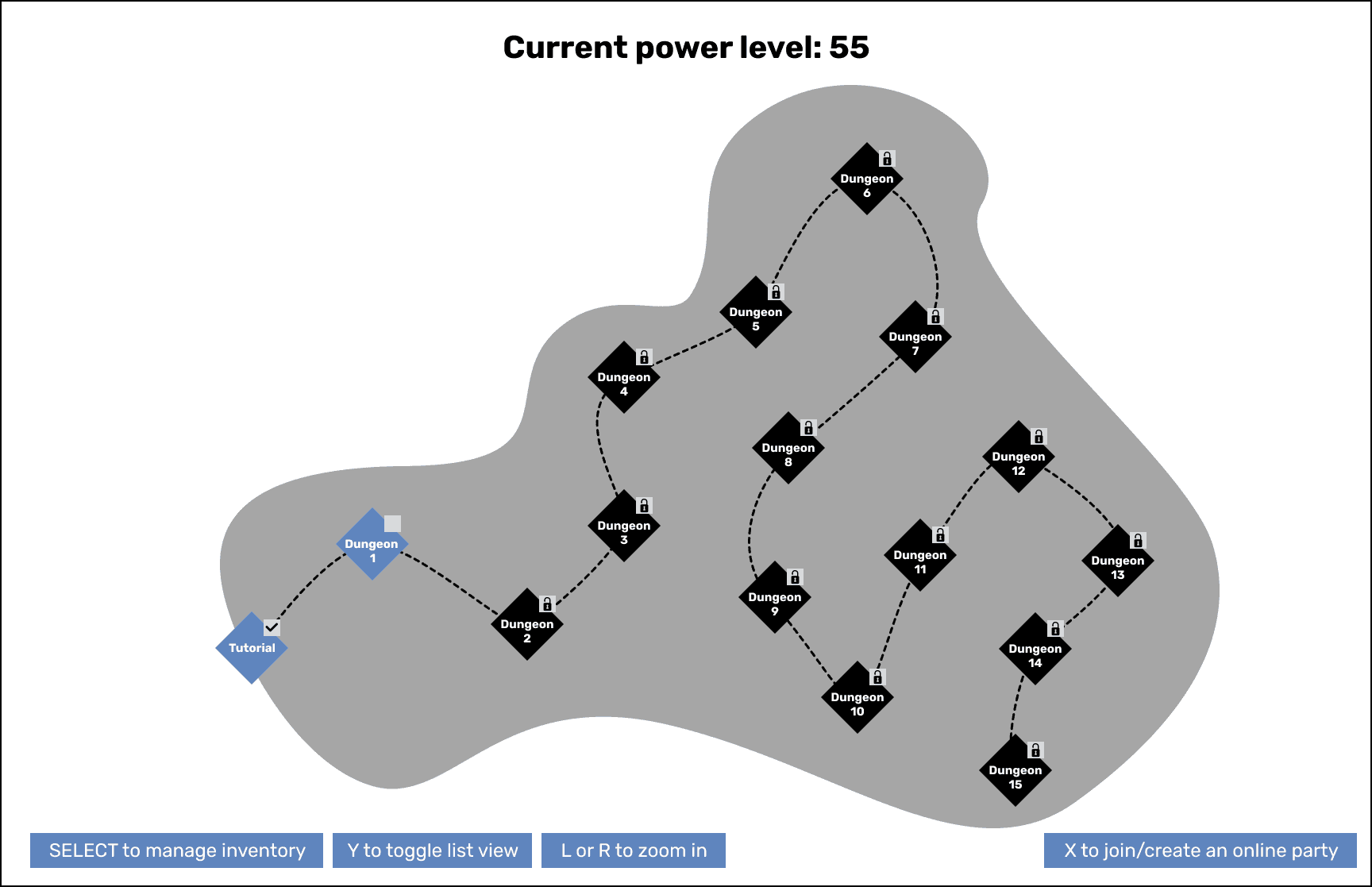
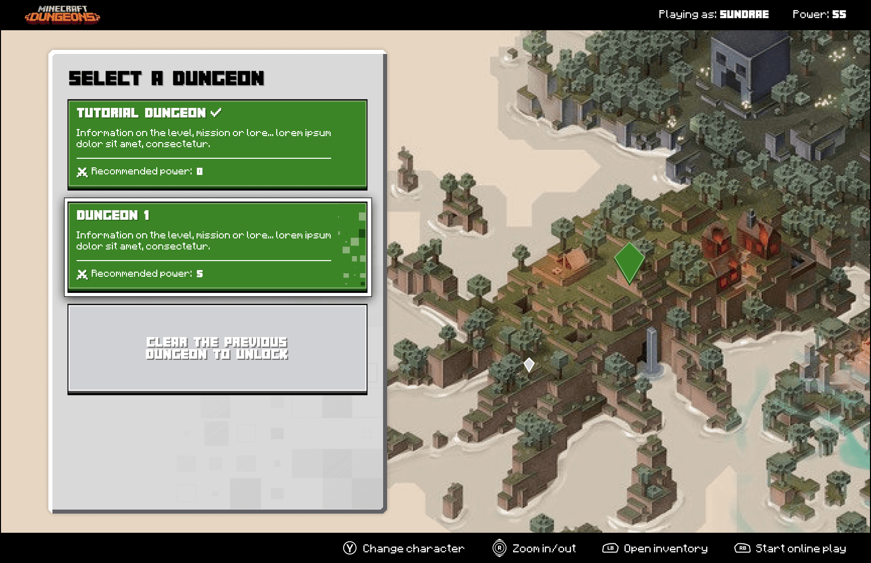
Map View
The main view when a player needs to select a level. They'd be able to view all the different levels to see what's open, locked or see any relevant art that we may add in the end.
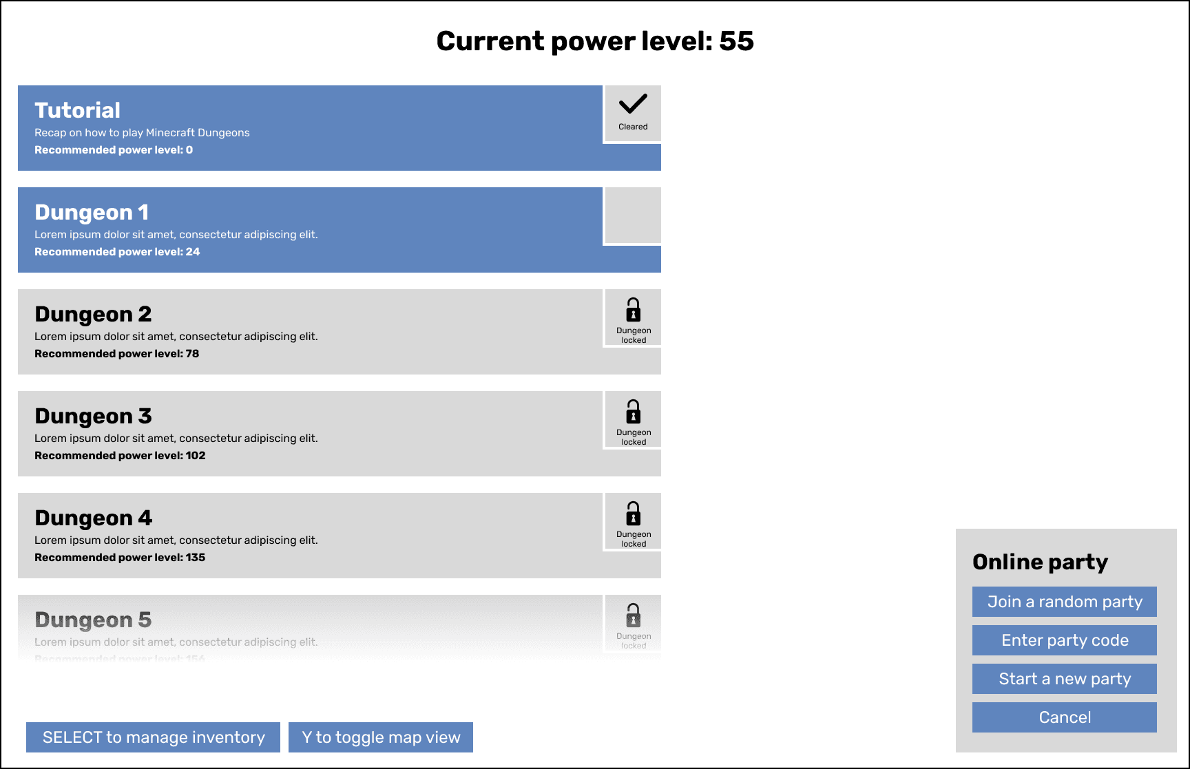
List View
We offer a streamlined list view for users overwhelmed by the map. Players can also select from multiple party options.
Level Select (Party leader)
Players can choose higher level difficulties for extra items, but it's optional. Party leaders or solo players control these settings.
Level Select (Party member)
As a party member you let the leader decide and "Ready" to show you're ok with the selection and waiting for the game to start.
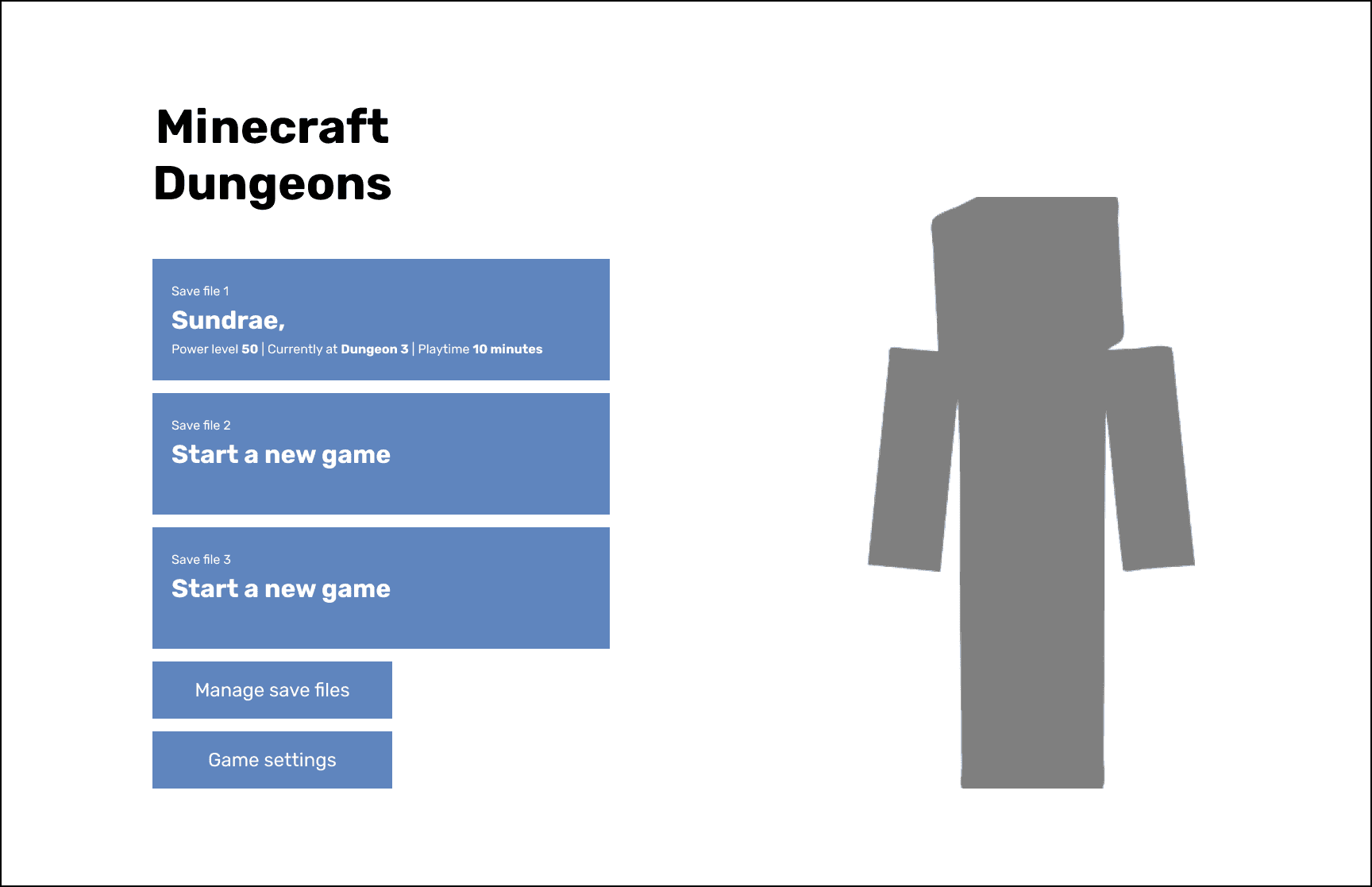
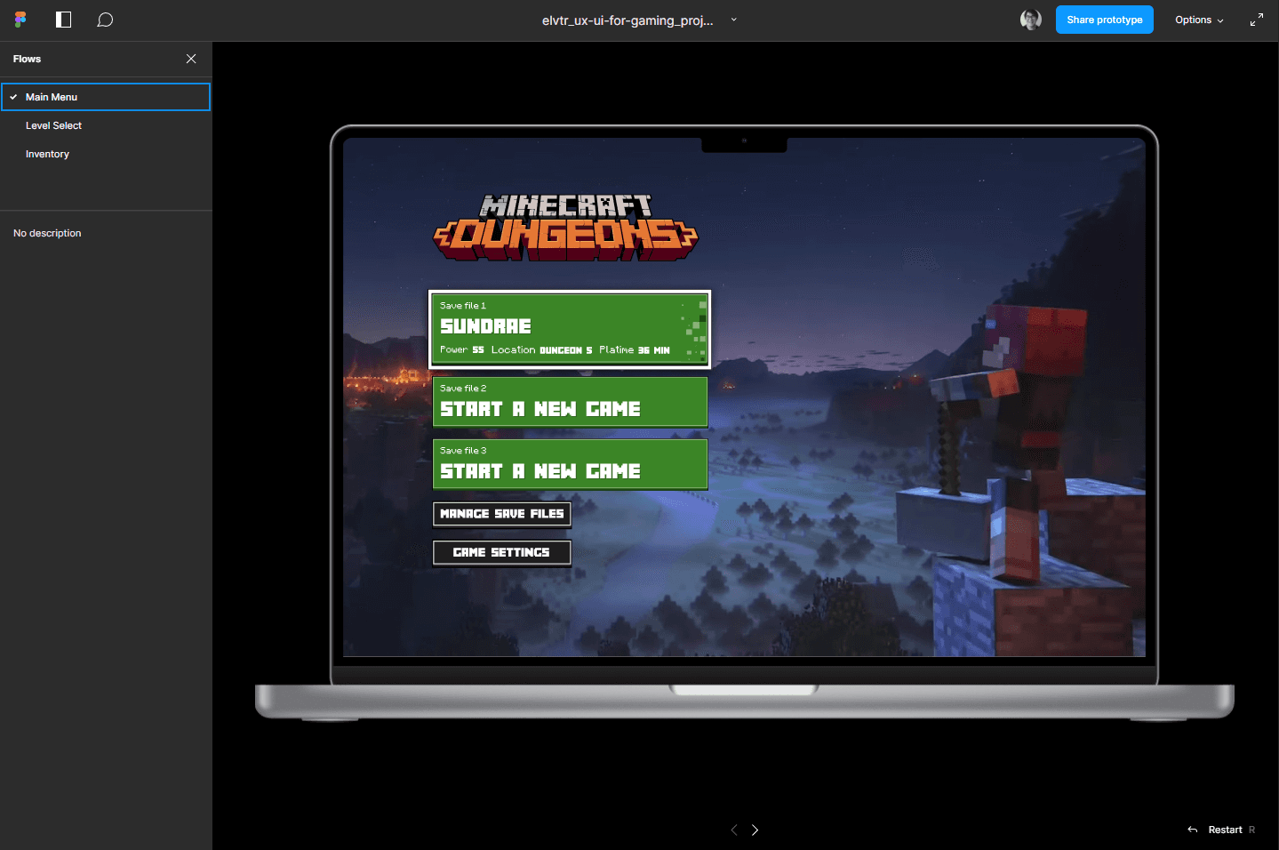
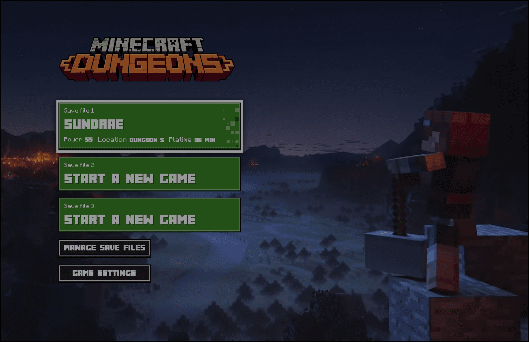
Main Menu
Functionality moved left, leaving the right side empty. Save files are stacked, with options to delete, copy, or manage. Selecting a file starts the game.
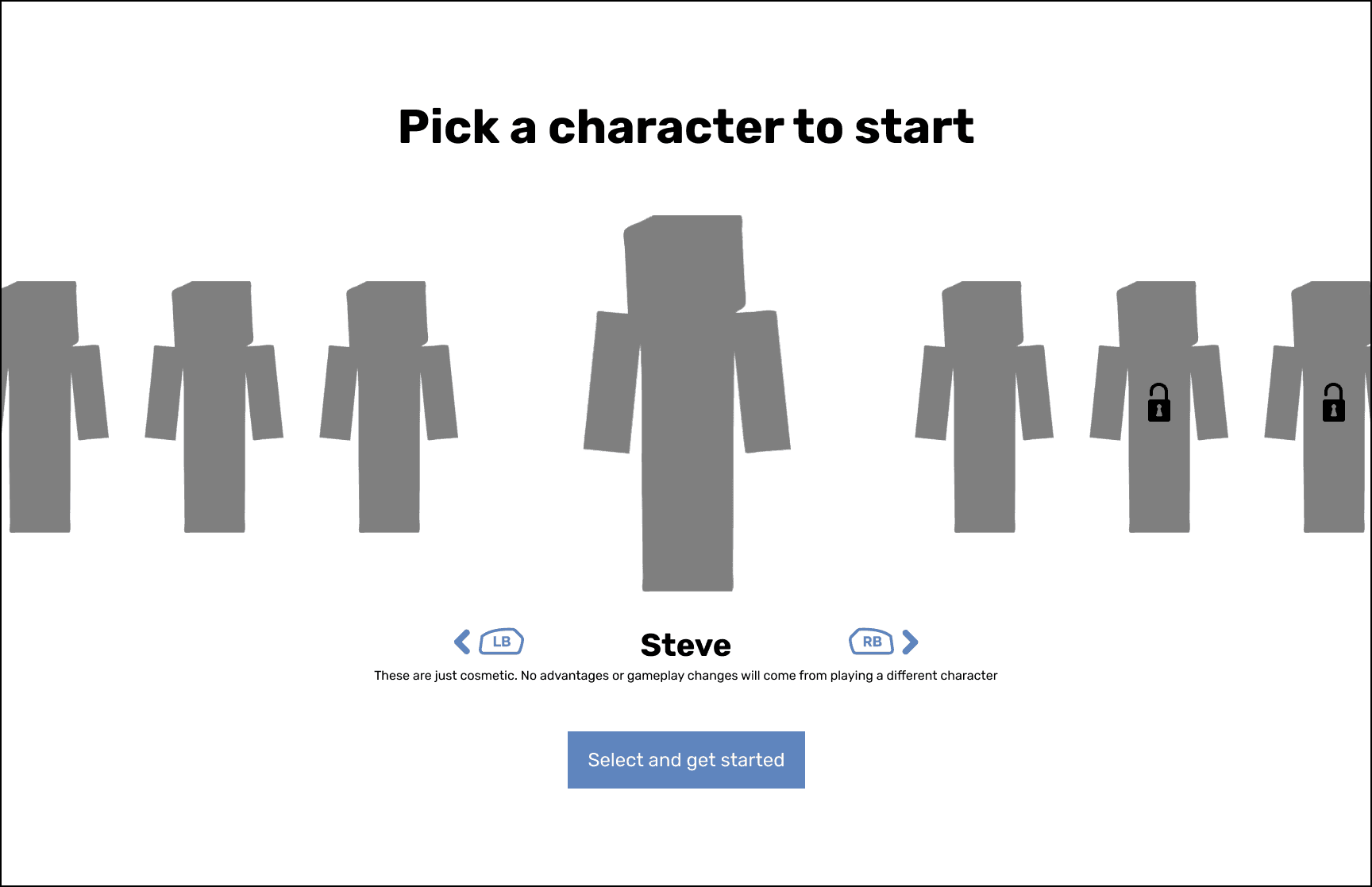
Character Selection
To improve user focus, the skin disclaimer was moved beneath character selection. XBOX controller button icons were added for enhanced clarity.
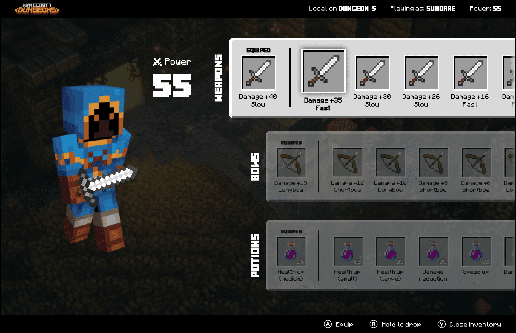
Inventory Management
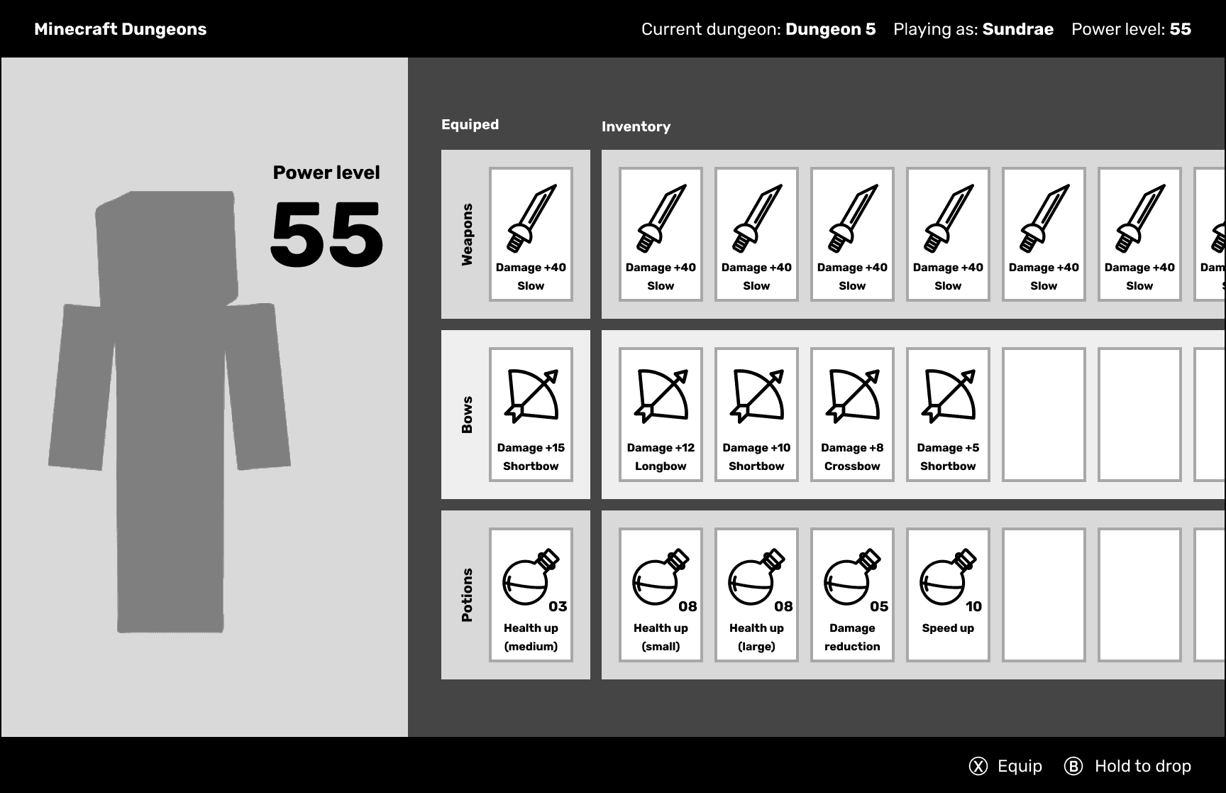
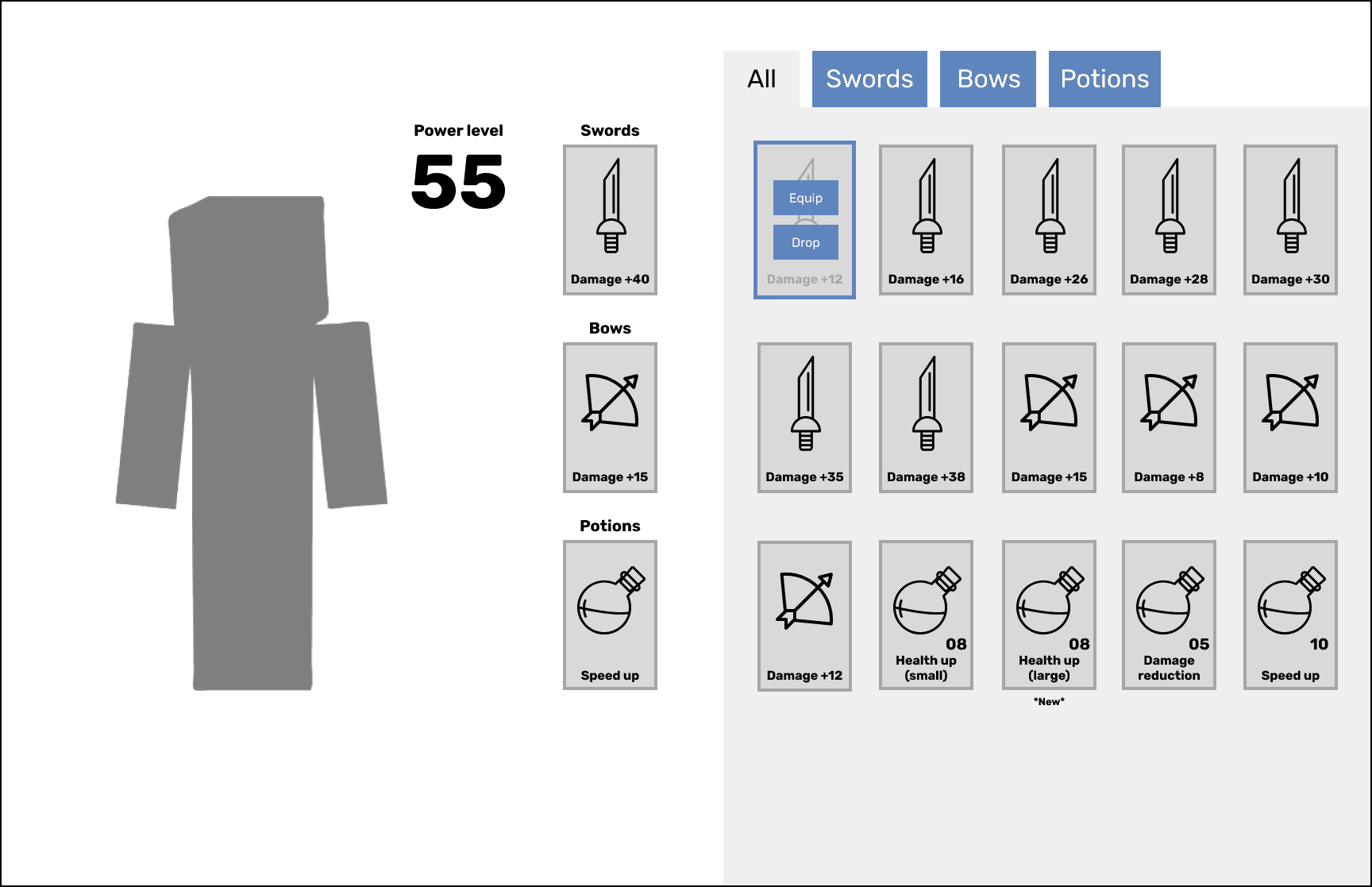
Inventory
Inspired by classmate feedback on the horizontal inventory layout, I prioritized quick item selection by placing the best item on the left, reflecting the game's focus.
Level Selection & Party Creation
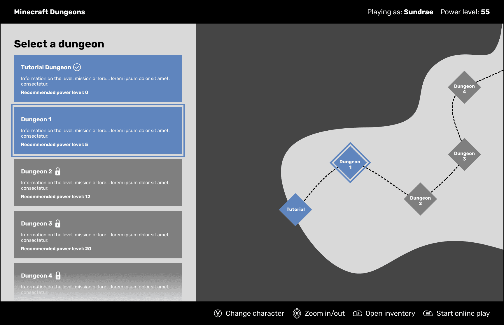
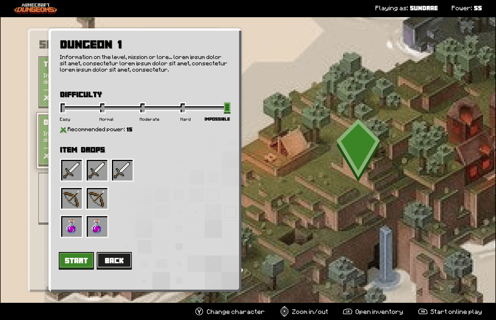
Level Select (Main)
I combined the list and map view to streamline the experience. This also helped fill in the emptiness both screens had and kept things visually interesting and balanced.
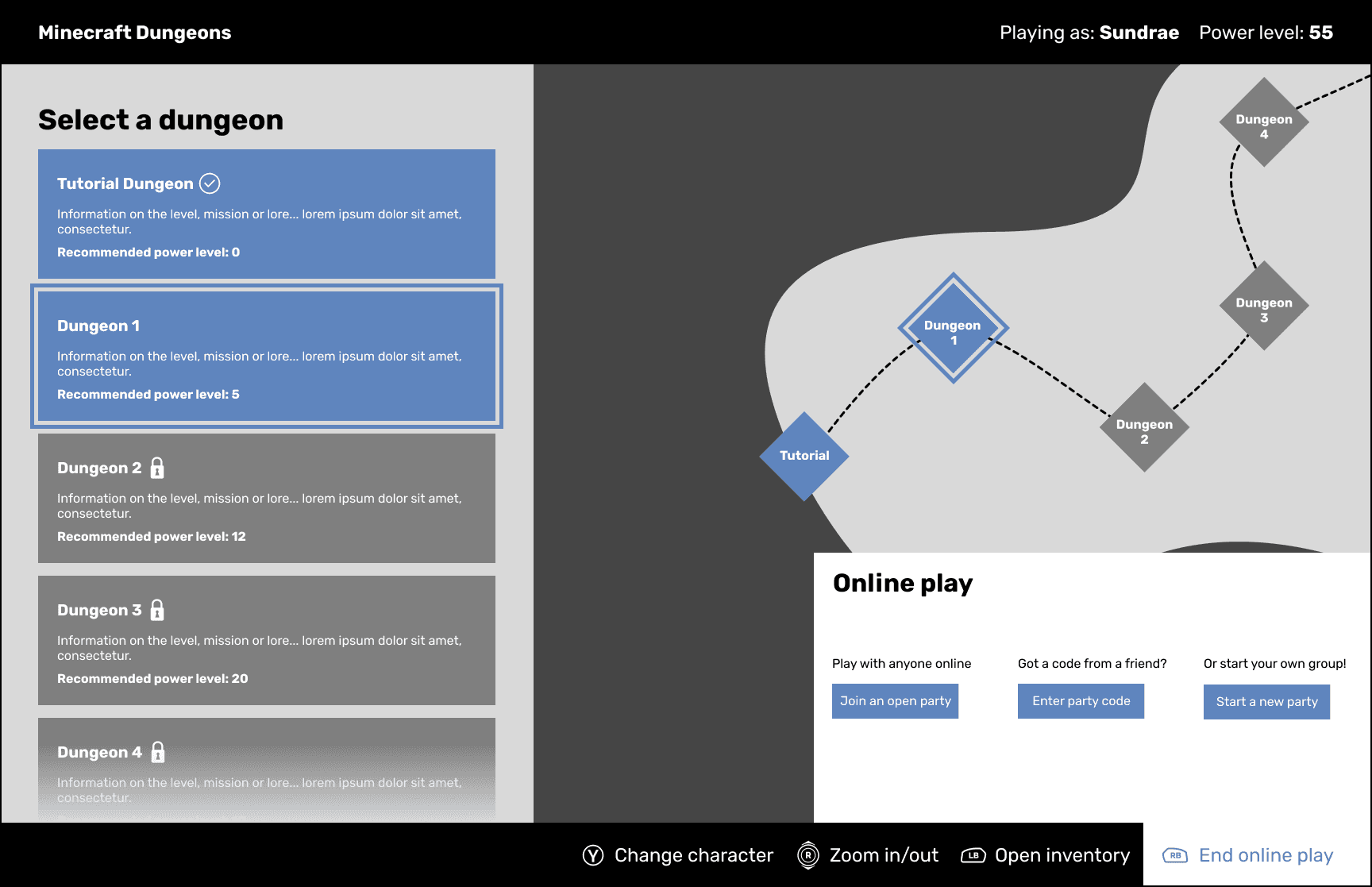
Level Select (Online Play)
This stayed mostly similar other than adding a little more description to each action and resorting how the items were displayed to better match with the other party screens.
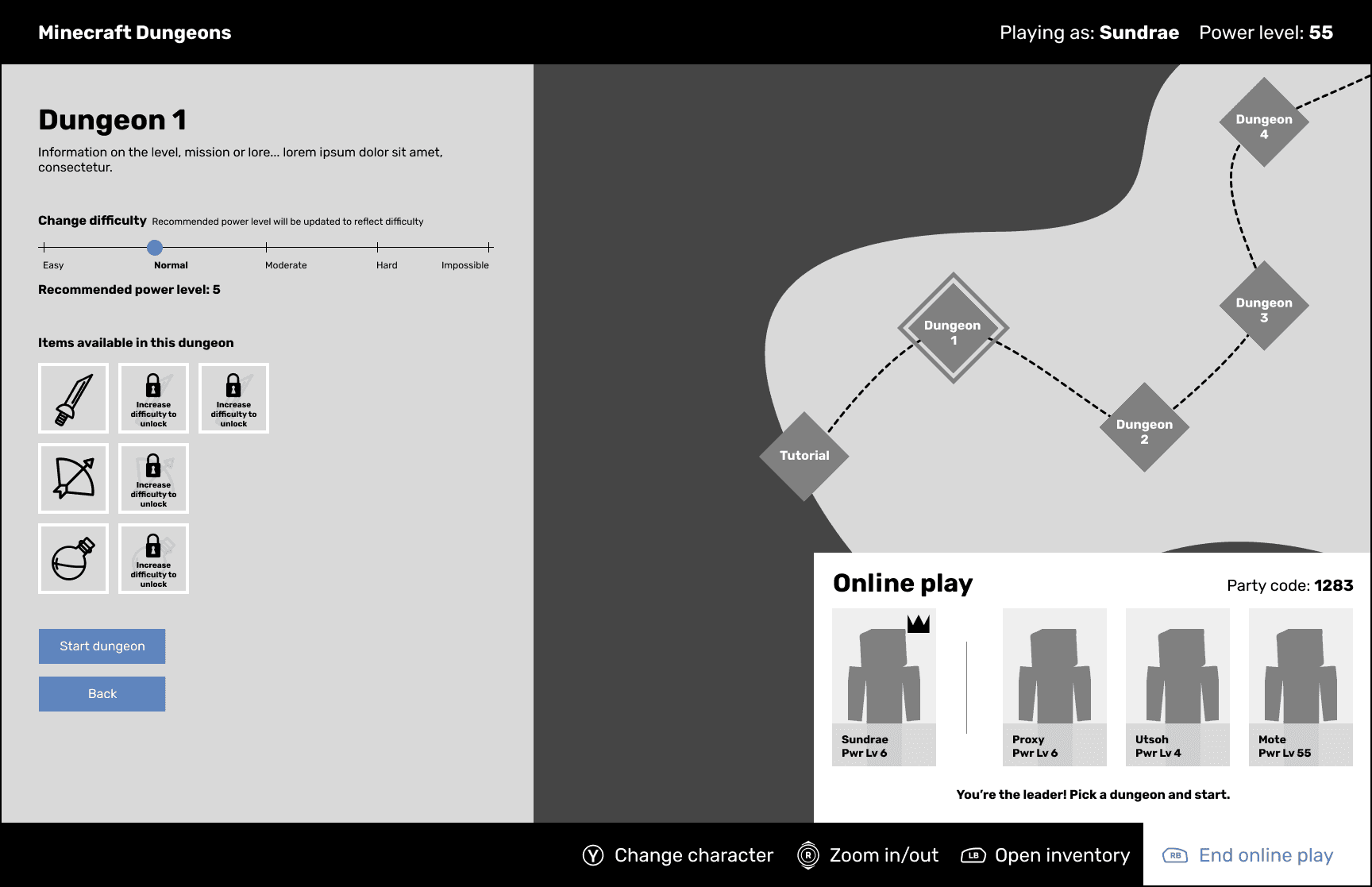
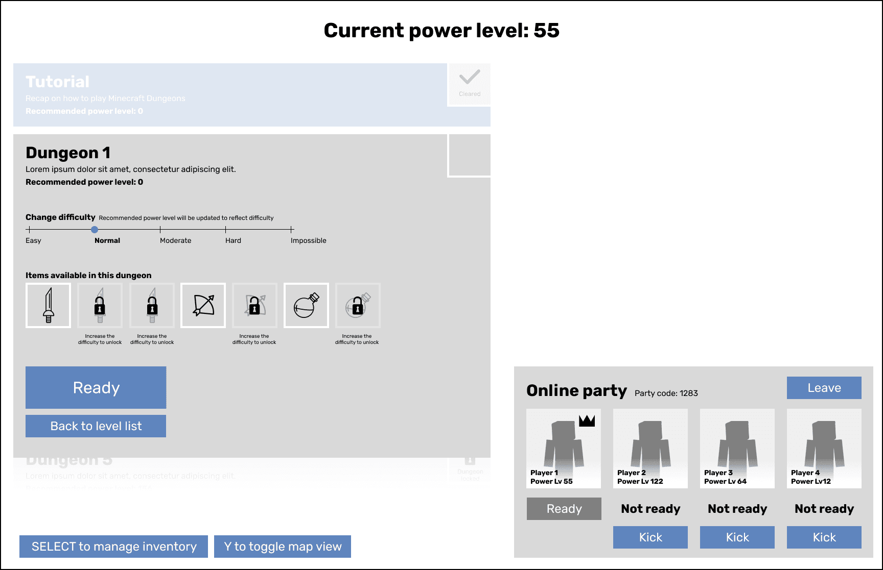
Level Select (Party Leader)
Cleaned up the party screen a bit to better clarify which character is yours and who the party leader is. To match the updated inventory I also laid them out in rows.
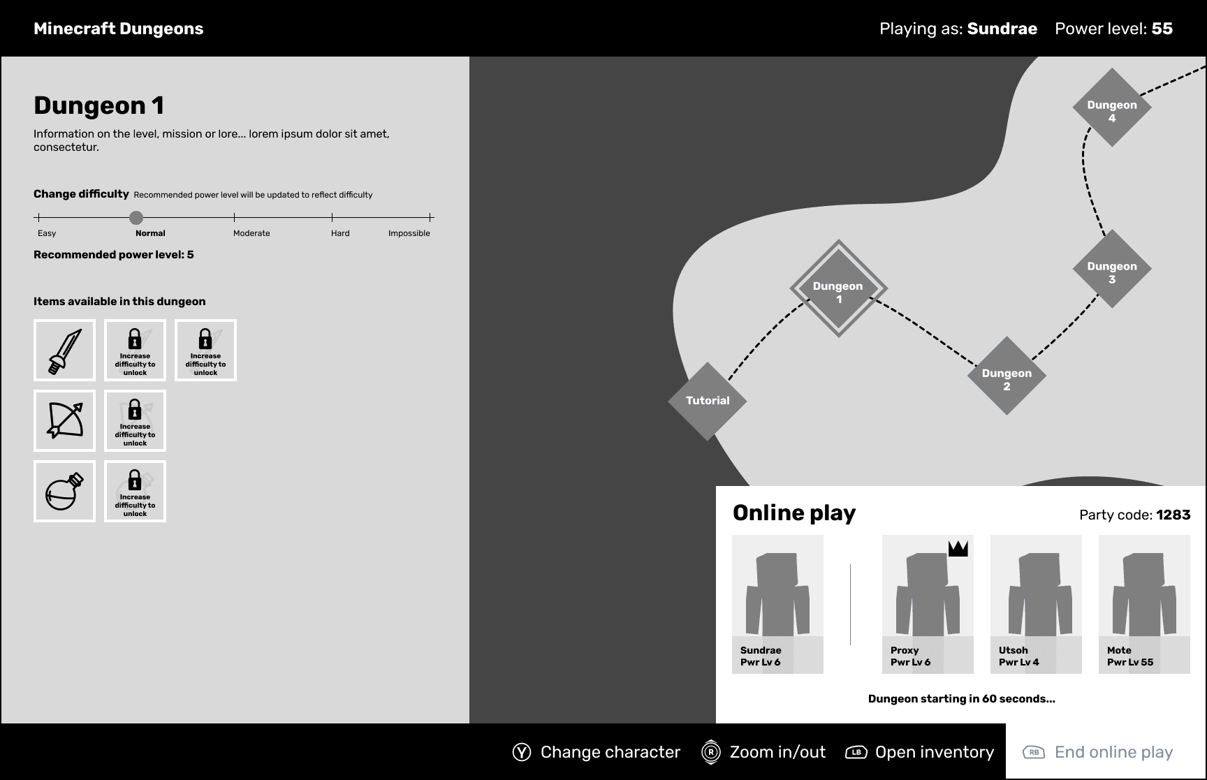
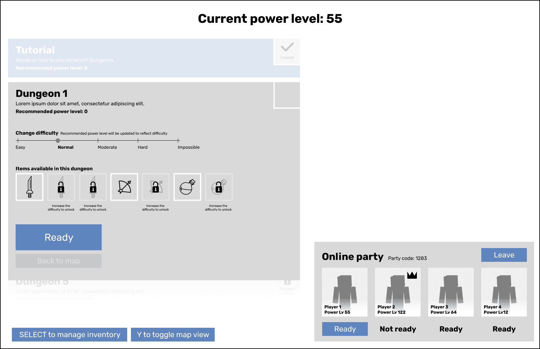
Level Select (Party Member)
To streamline the level start, I introduced a countdown, removing the need for individual "Ready" buttons. This reduced user action, improving efficiency.